Evaluate
Review existing screens and interaction patterns.

I joined a live mobile product with ~250 users, no existing design files, and an outdated/inconsistent interface. I reconstructed the product in Figma, established a reusable design foundation, redesigned the areas I owned, and worked with developers to get the new experience into the App Store.
Overview
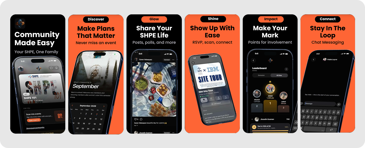
Society of Hispanic Professional Engineers (SHPE) NJIT's mobile app is a live iOS and Android product used by roughly 250 students and alumni. I joined the team to improve an existing experience that had already been built and shipped, but lacked a centralized design foundation and consistent visual system.
I began by conducting a design audit and sharing my findings with our project manager. From there, I helped rebuild the existing product in Figma, establish reusable interface patterns, and redesign major areas including Home, Events, and Settings. Throughout the process, I worked closely with developers to refine designs around implementation constraints and support the experience through development.
Problem
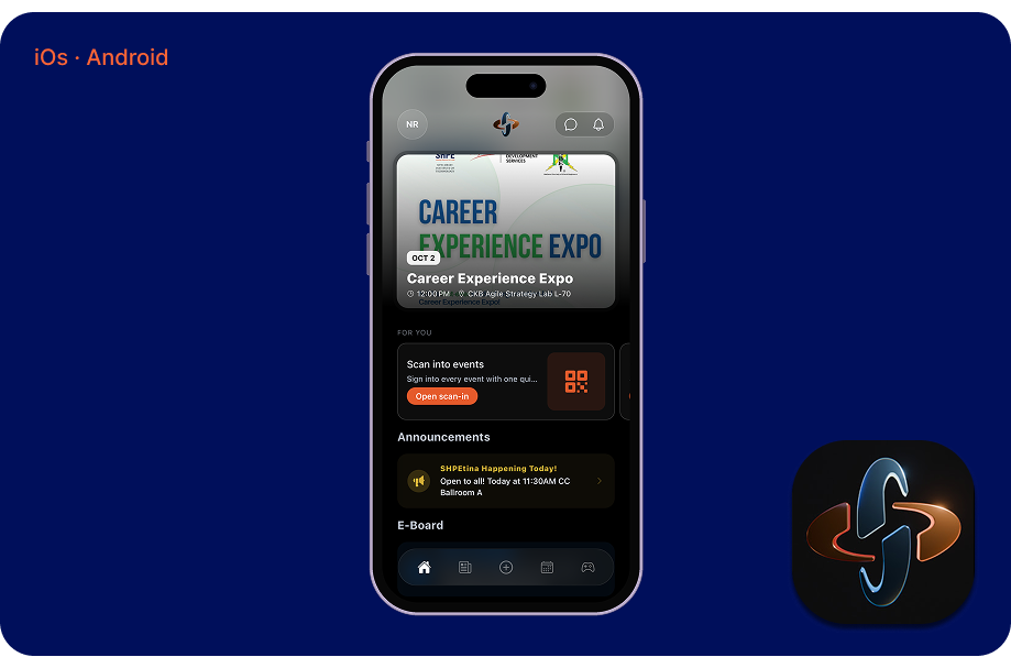
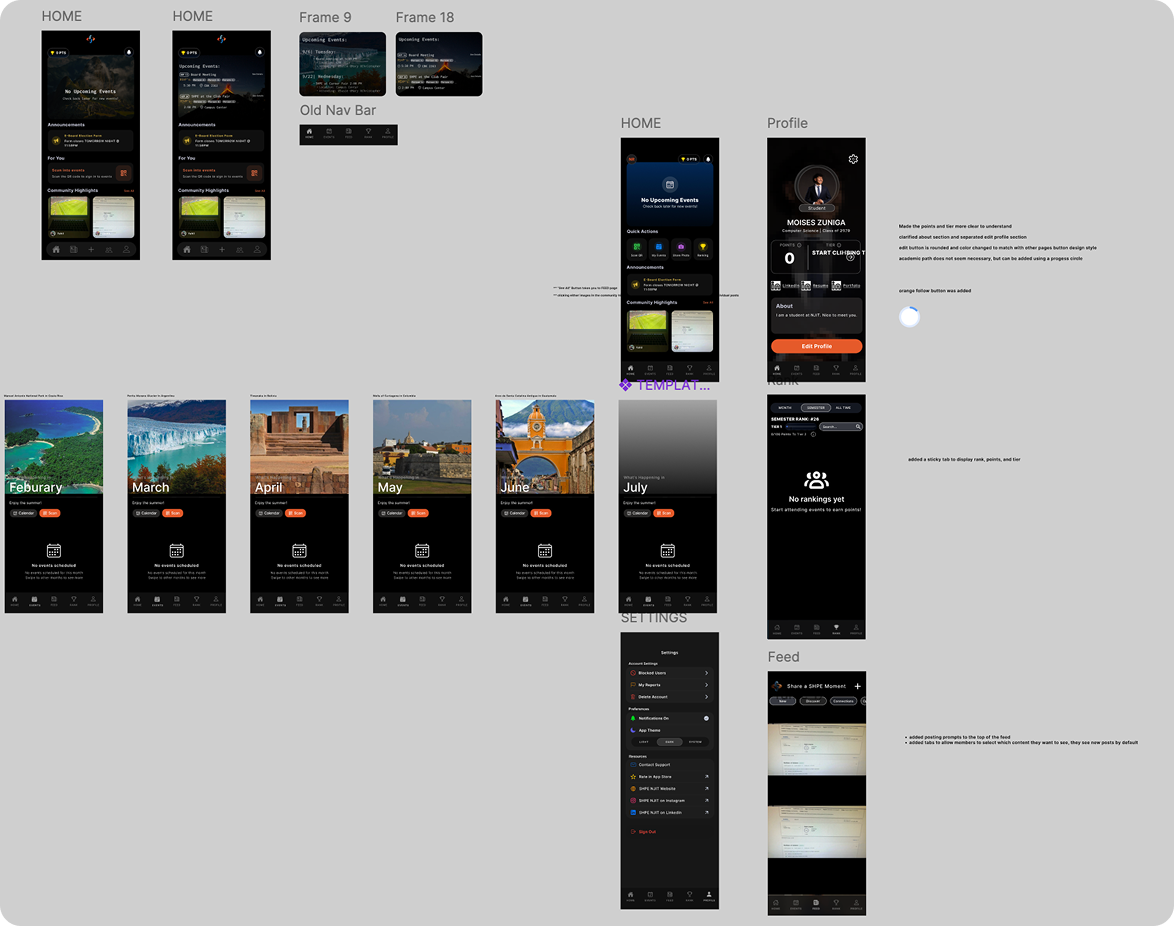
When I joined the SHPE development team, the mobile app was already live and serving roughly 250 students and alumni. However, the interface lacked consistent visual patterns, and there was no centralized Figma file documenting the existing product.
Without a shared design foundation, maintaining consistency across screens and planning future improvements became more challenging.
UX Audit
I documented usability issues across the existing experience and prioritized improvements based on their severity and impact on core workflows.
Review existing screens and interaction patterns.
Assign severity ratings to documented issues.
Translate findings into interface improvements.
Process & Solution
With no centralized Figma file or established component library, I began by reconstructing the existing interface to create a shared design foundation. This allowed our design team to standardize recurring UI patterns, improve consistency across screens, and create a more reliable reference for developers.
Redesigning the experience
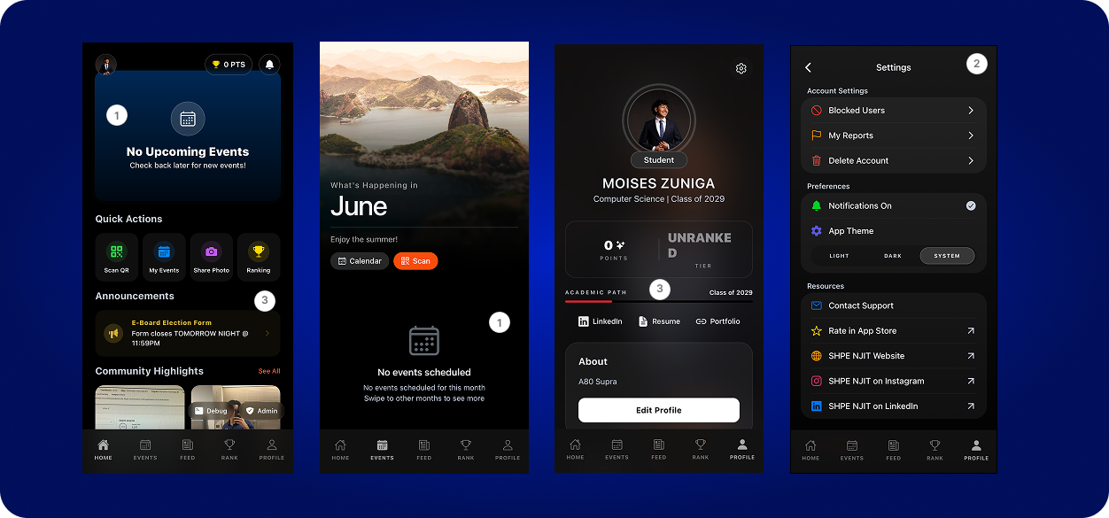
Working within an already-launched mobile app, I redesigned the Home, Events, and Profile & Settings screens while preserving the product's core functionality. My focus was on improving content hierarchy, simplifying navigation, and establishing consistent interface patterns without disrupting the existing experience.
01 | Home
The original Home screen relied heavily on quick actions and empty states.
I reorganized it around upcoming events, announcements, and community activity, creating a clearer hierarchy that gives members more relevant information at a glance.
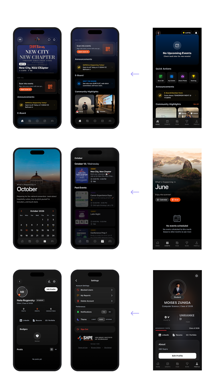
02 | Events
The original Events screen offered limited guidance when no events were scheduled.
I introduced a calendar and structured event listings to help members browse upcoming activities and find relevant event information more easily.
03 | Profile & Settings
I refined the Profile and Settings screens to improve the organization of account information, membership details, and preferences.
Consistent components and clearer grouping make these areas easier to navigate and maintain.
Collaboration
Beyond redesigning individual screens, I worked to establish a shared design foundation that developers could reference throughout implementation. Reusable components and consistent interface patterns helped reduce ambiguity between design and development while supporting future product updates.
 3Core areas redesigned
 ~250Existing app users
 iOS + AndroidProduct platforms