Designing a mobile app for
Chimera Home Security
I led the design thinking and prototyping for Chimera,
a home security platform built around locally stored surveillance data. Our redesign focused on transforming the messy desktop interface into a mobile experience for viewing live cameras, reviewing detected movement, managing saved footage and monitoring storage.

Home surveillance can offer security without giving up control of your data.
Overview
Chimera began in 2021 as a home security system Jay built specifically for his parents. Unlike larger security platforms such as Ring or Eufy, Chimera was designed to keep surveillance data on the user’s own machines rather than storing it on a company’s backend servers. It was originally built for a very specific audience, so Jay could personally explain how everything worked. When others began showing interest in using Chimera for their own homes, that approach no longer scaled. Chimera needed to become something a new user could understand and navigate on their own.
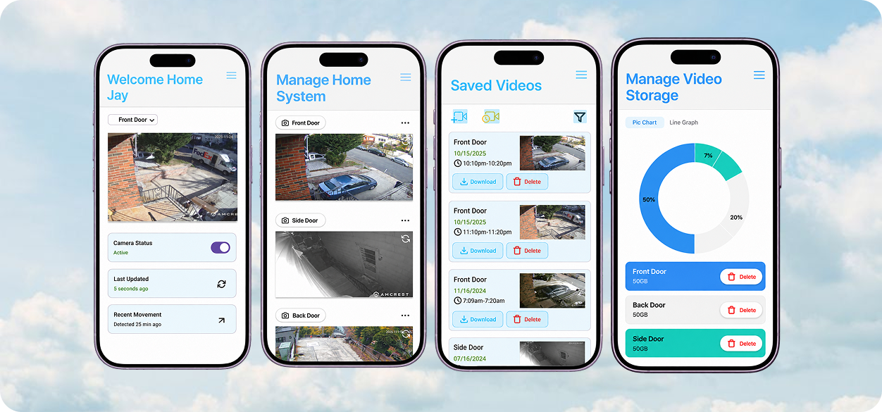
Chimera was built to work, but not necessarily to be learned.
Problem
Because Chimera was originally created for Jay’s parents, its interface did not need to guide unfamiliar users through features. Many interactions relied on technical controls, unclear labels, and dense screens that made it difficult to know what to do next. The experience was also designed primarily for desktop, creating additional challenges when translating its functionality to mobile. As Chimera gained interest beyond its original users, the interface needed to become self-explanatory. Our challenge was to preserve the functionality Jay valued while making each action clear enough that users would not need him there to explain how it worked.
The original Chimera prioritized functionality over guidance.
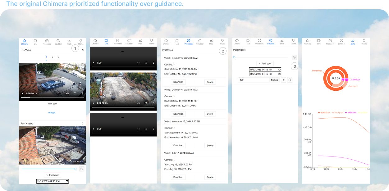
- 01Navigation overloadEvery feature competed for space in the top navigation.
- 02Missing status feedbackProcesses gave little indication of whether an action was running or complete.
- 03Unfamiliar controlsThe scrubber relied on technical inputs that were difficult to interpret without prior knowledge.
Before redesigning, we needed to understand where the friction was coming from.
Research
Since we couldn’t directly interact with the existing version of Chimera, our research began by analyzing its current screens and video flows. We mapped how users moved through key features and compared our findings to uncover recurring usability issues across the experience.
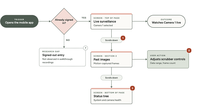
01 / Mapping the Experience
We mapped Chimera’s existing flows to understand how users accessed live cameras, past footage, video processing, and storage management. This exposed friction points where unclear controls, dense screens, and technical interactions could interrupt the experience.

02 / Competitive Analysis
After identifying friction in Chimera’s existing experience, we looked at established home security products to understand how they made similar features easier to navigate. Ring stood out for its clean layouts, simple navigation, and clearly presented functions, giving us a reference for how familiar interaction patterns could reduce Chimera’s learning curve.
Our Takeaway:
Chimera needed the clarity of familiar security apps while preserving the local control that made it different.
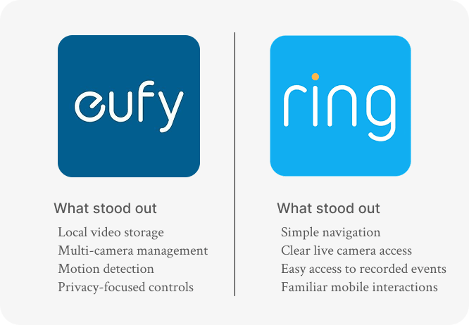
What stood out
- Local video storage
- Multi-camera management
- Privacy-focused controls
What stood out
- Simple navigation
- Clear live camera access
- Easy access to recorded events
Designing a clearer Chimera
Process & Solution
With the main friction points identified, we moved into Figma to translate Chimera’s desktop functionality into a simpler mobile experience. We focused on reducing screen density, making actions easier to recognize, and keeping important security information within reach.
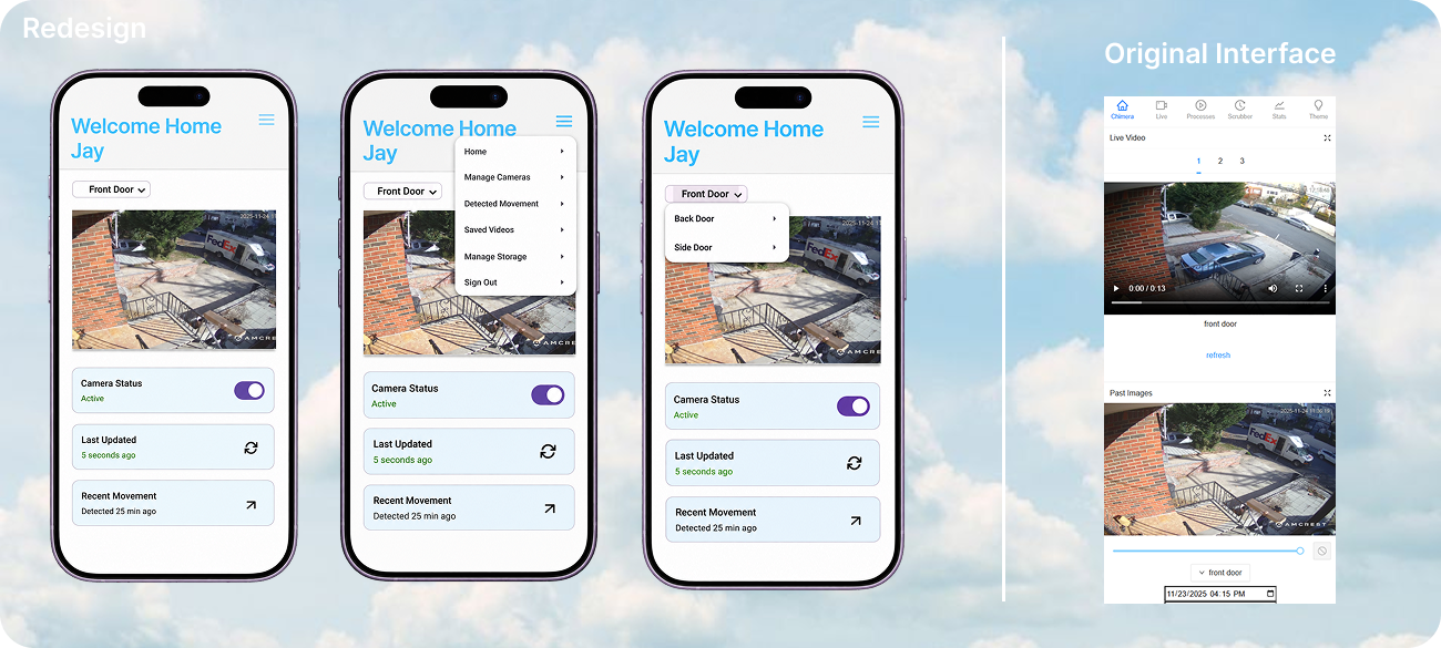
Redesign
Original Interface
01 / Simplifying the experience
Everything didn’t need to be visible at once.
Chimera’s original interface placed nearly every feature within the same navigation, making the experience feel dense and difficult to scan. We reorganized the mobile experience around individual tasks, keeping secondary features accessible without competing for attention.
02 / Making Information Intuitive
Complex tools became clearer,
more visual, and easier to act
on.
Across Scrubber, Processes, and Stats, we replaced technical inputs and dense information with clearer controls, visual feedback, and recognizable actions.
- Scrubber:
- Technical inputs → visual footage discovery
- Processes:
- Text-heavy status → visual processing feedback
- Storage:
- Raw storage data → actionable storage management
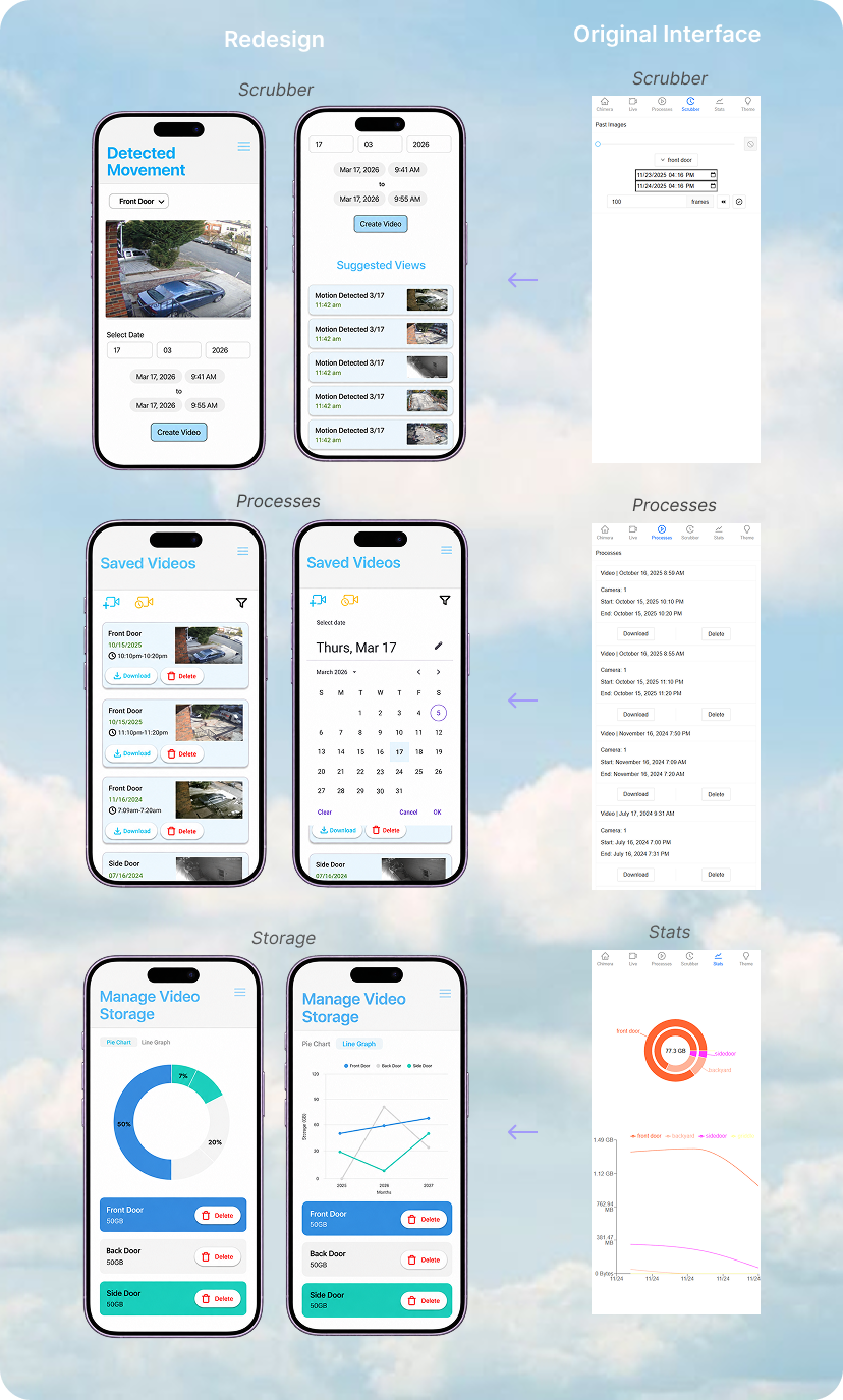
Redesign
Scrubber
Original Interface
Scrubber
Redesign
Processes
Original Interface
Processes
Redesign
Storage
Original Interface
Stats
We redesigned Chimera around its biggest pain points. Here's what I learned.
Conclusion
This project challenged us to rethink a system that already worked without stripping away the functionality that made it useful. By mapping Chimera’s existing experience and redesigning its most technical interactions, we focused on making the product easier to understand without losing the simplicity Jay valued.
01 / Takeaway
Designing for someone who isn't in the room.
Chimera originally worked because Jay could explain it to its users. Redesigning it showed me the importance of creating interfaces that communicate what to do, what is happening, and what comes next on their own.
02 / Takeaway
Function first, then form.
Jay consistently prioritized functionality over flashy design. Working within that constraint pushed us to use visual design with purpose, focusing on hierarchy, feedback, and recognizable interactions rather than decoration.
Design based on research
Mapping Chimera’s existing experience showed me how research can turn observations into intentional design decisions. Instead of redesigning based on what looked better, we used the friction points we uncovered to guide what we changed and why.

It took multiple iterations, team meetings, and feedback from Stakeholder Jay to bring Chimera’s redesign to life.
Working through each round helped us better understand the product, challenge our decisions, and shape the final experience.
Thanks for reading! And a huge thank you to Isa and Emis who helped bring this project together. :)